Olive Branch
Plant care educational site and e-commerce shop
Olive Branch logo
Project Overview
Olive Branch is a business formed by myself and three other colleagues. Our company focuses on education, sustainability, safety and experiences. Our first product is a website that educates people about plants and sells plants directly to consumers.
-
Dates
February 2022 - April 2022
-
Methods
User centered design, Affinity diagram, Qualitative interviews, Quantitative surveys, Persona, Empathy map, Usability testing
-
Tools
Figma, Maze, Google Forms
-
My Role
UI Design, UX Research, UX Writing, Project Manager
Discovery
After a few productive rounds of ideating with my business colleagues, we realized that we all shared a passion for nature. From there, we decided that we wanted nature to be the inspiration for our company. More specifically, we wanted to reach customers who wanted to fill their spaces with plants. With people spending more time inside of their homes due to the COVID-19 pandemic, many people are looking for ways in which to beautify their spaces. Plants are a great way to do that, and they can also provide other benefits such as air purification. With our business goal defined, we set out to understand our potential users through qualitative and quantitative research. Our qualitative study helped us narrow our business scope, and our quantitative study gave us insight into what products and services to provide.
To determine the interest of people wanting to learn about plants, their current plant preferences, and their current knowledge of plant care, our studies explored the following:
Current knowledge about plants
Plant preference
Level of interests in plants
Feelings about plants
Engagement with plants
Buying preferences
Qualitative Research
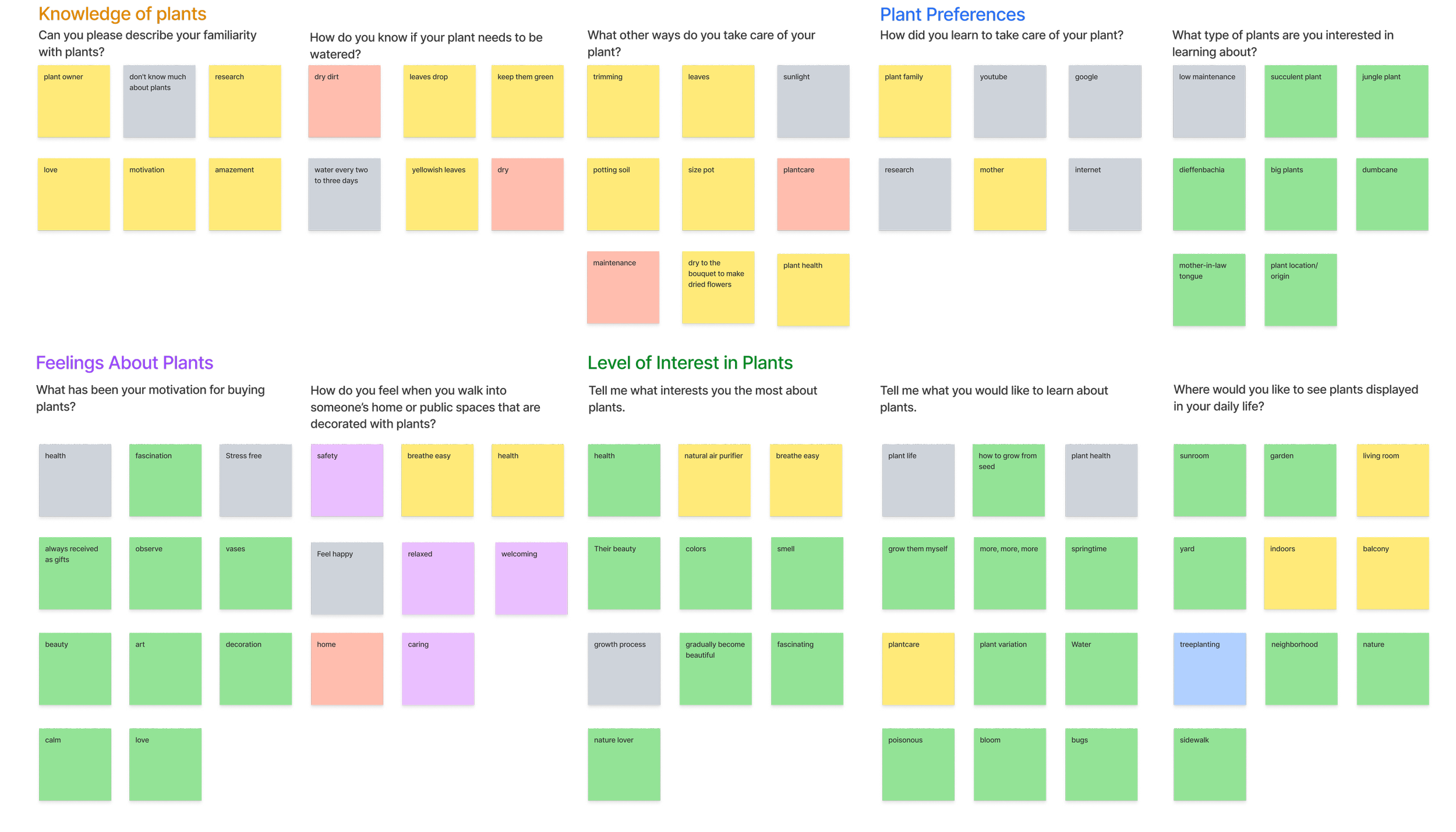
We coded our interview notes using the grounded theory analysis, and created this diagram:
Quantitative Research
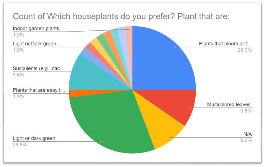
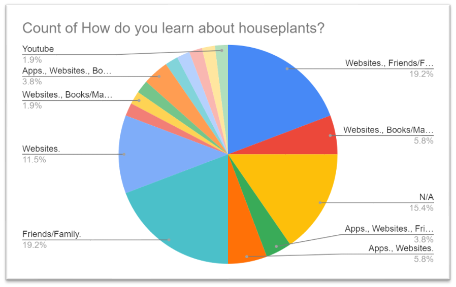
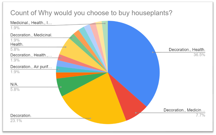
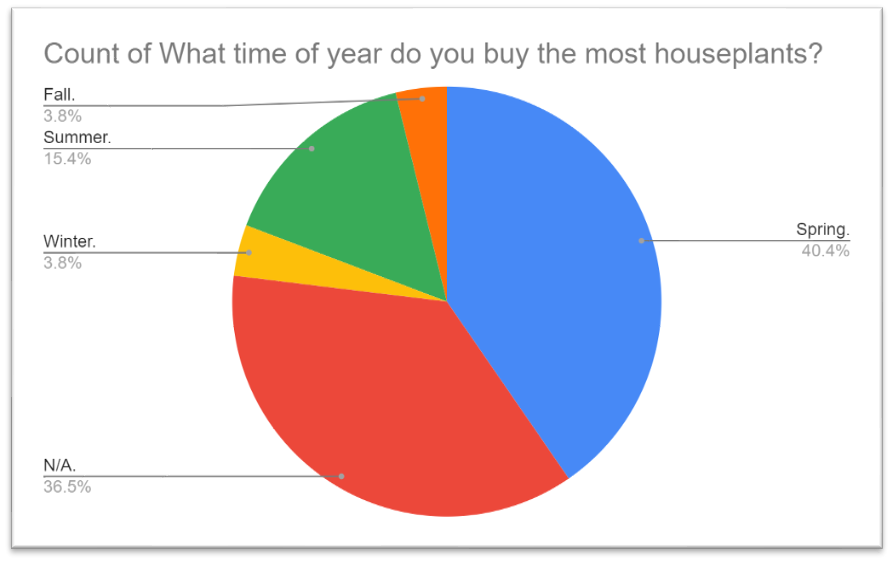
These piecharts visualize the survey responses received from 55 individuals:
Understanding Our Users
With our findings, we were able to define our users. Our persona and empathy map reflect some of the key findings from our research.

Persona
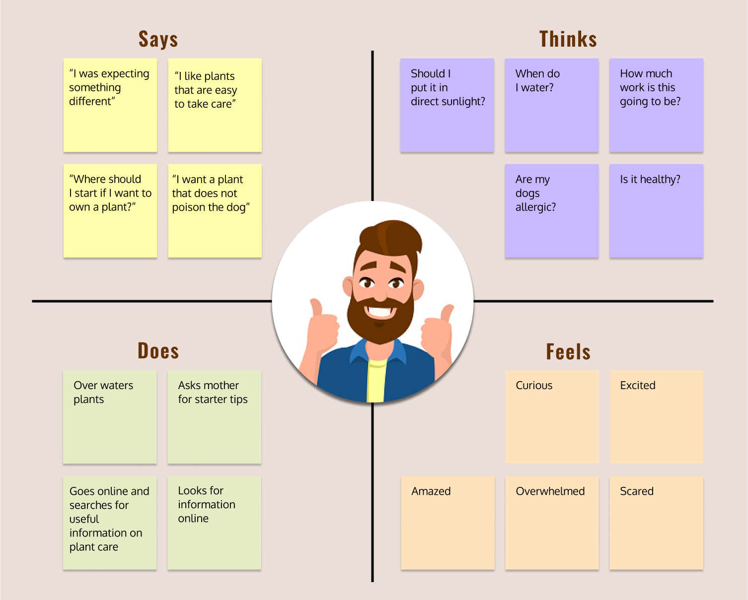
Empathy Map
Sketches
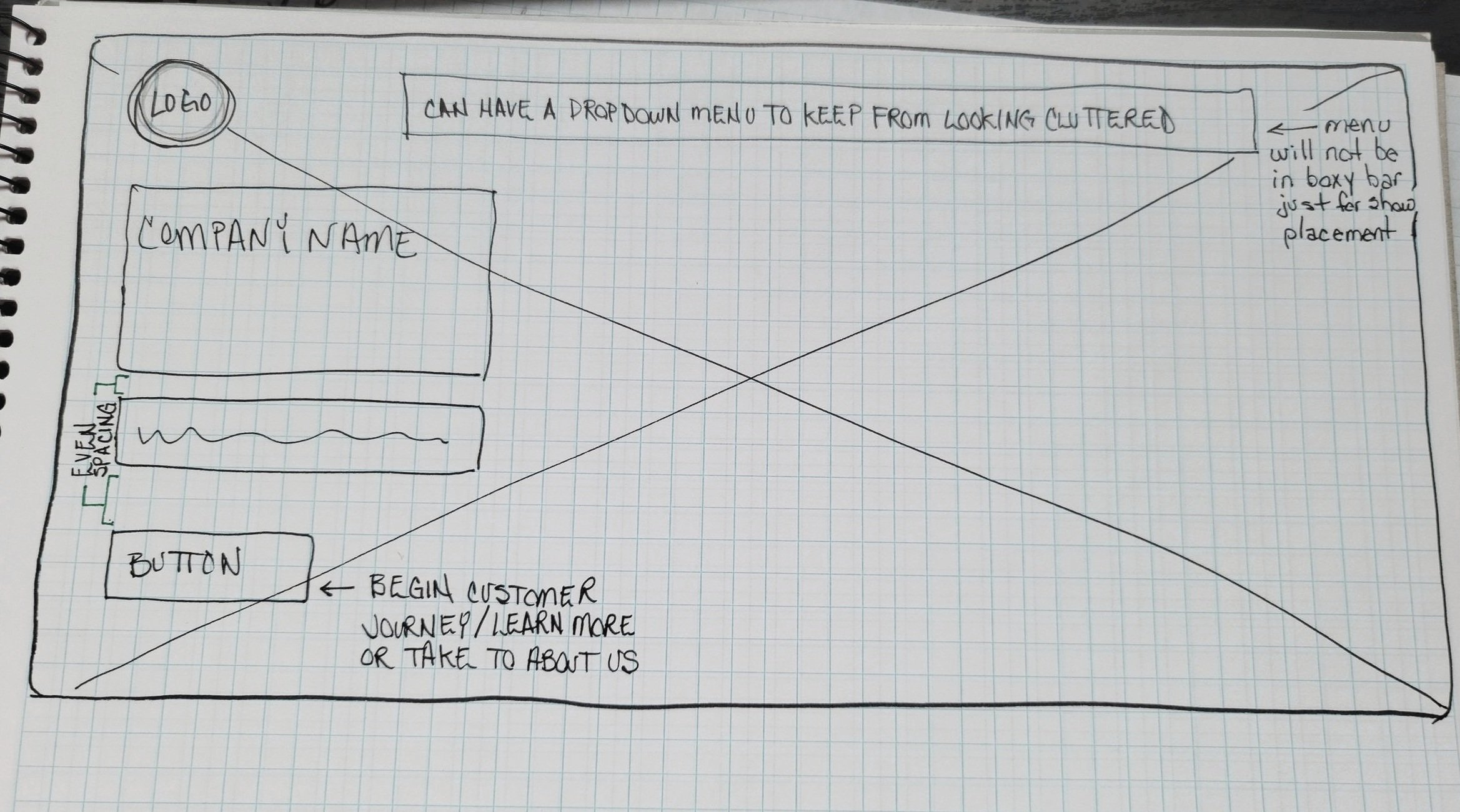
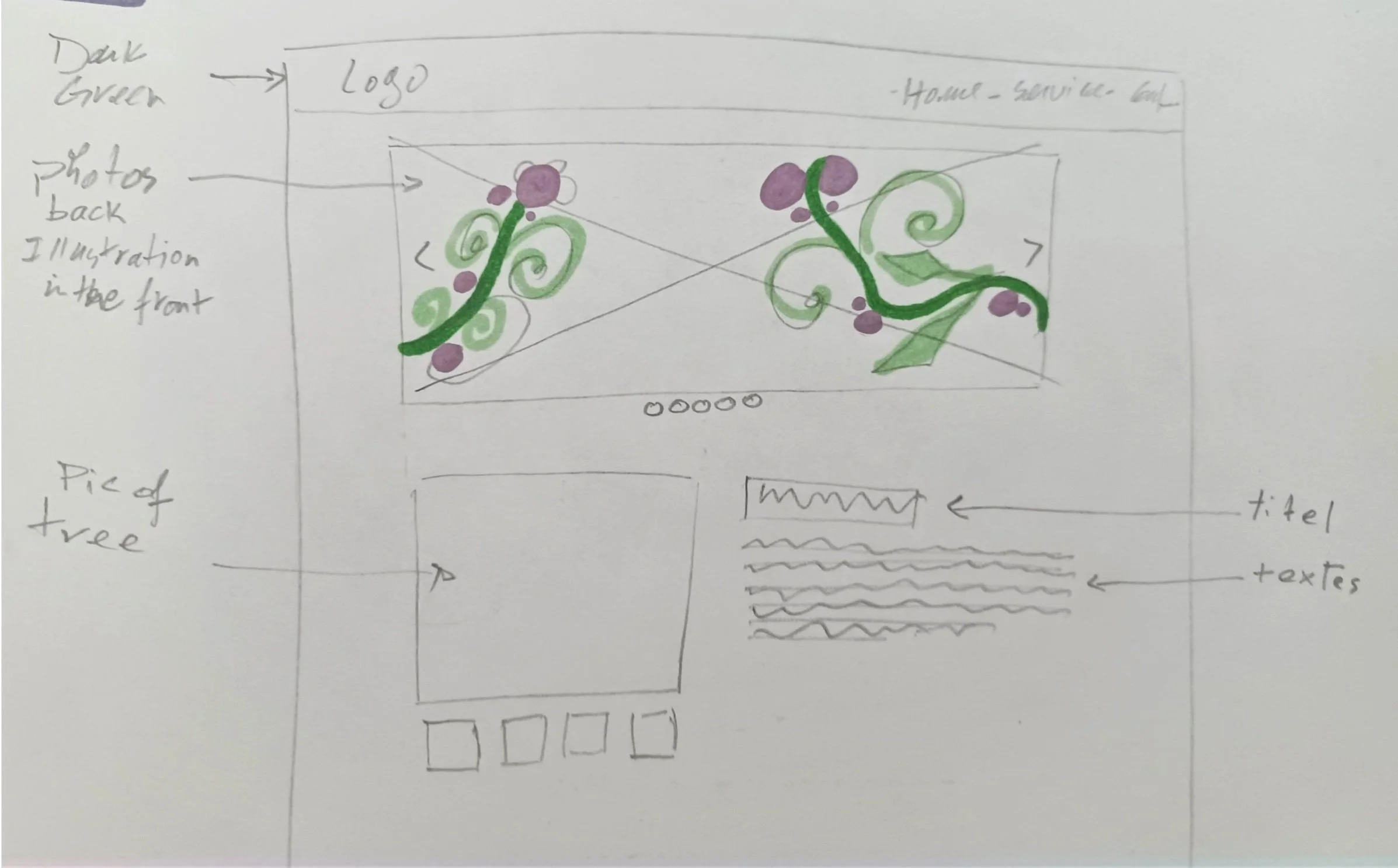
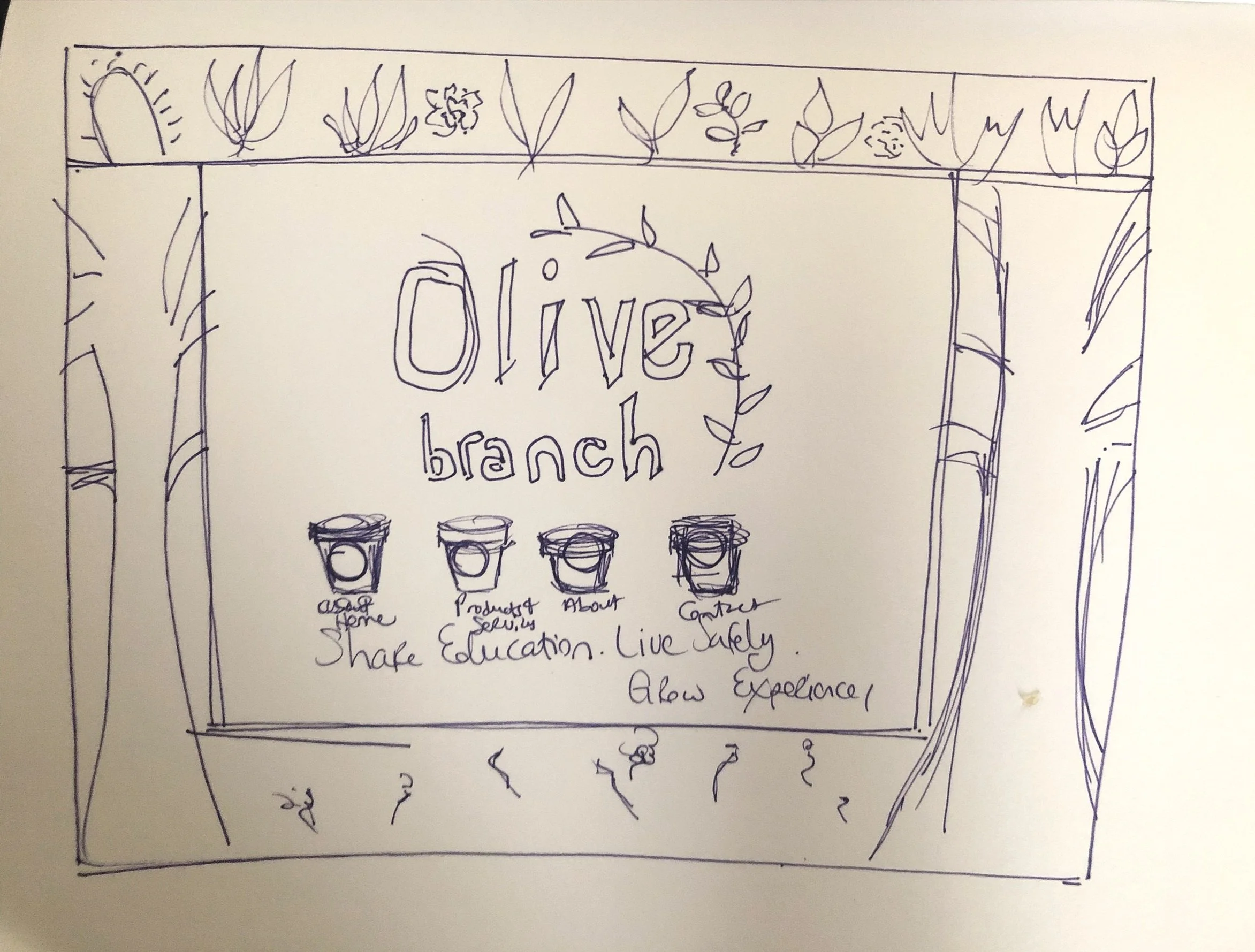
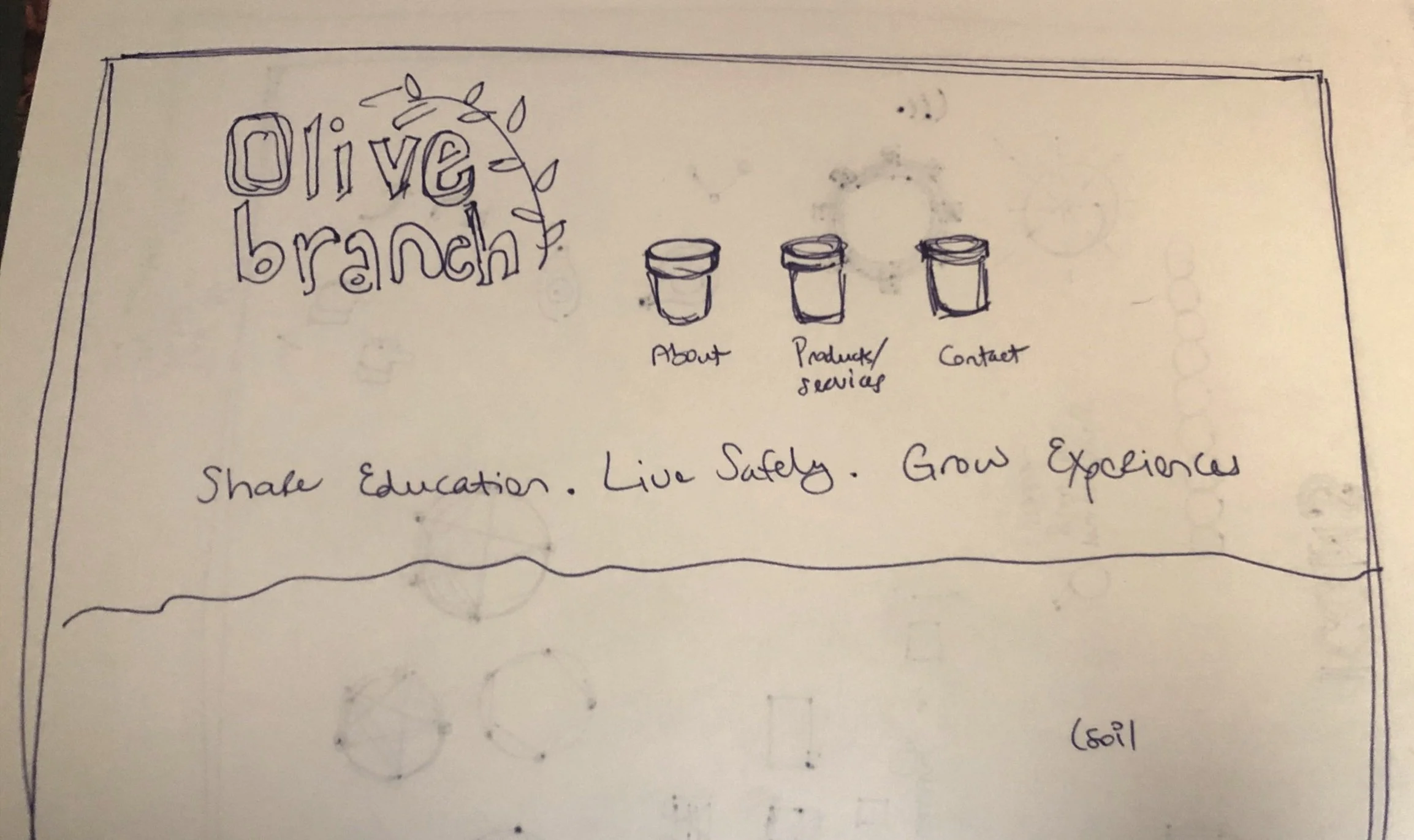
These are some screenshots of our early sketches. It was inspiring to see how we each conceptualized our company’s vision.
UX Design Process
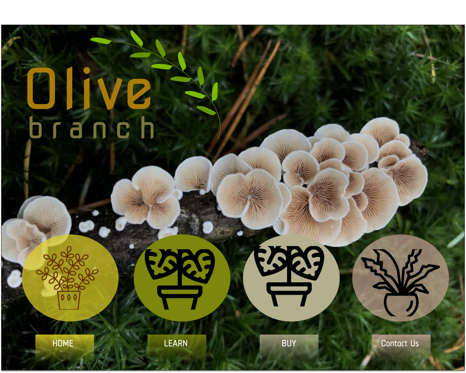
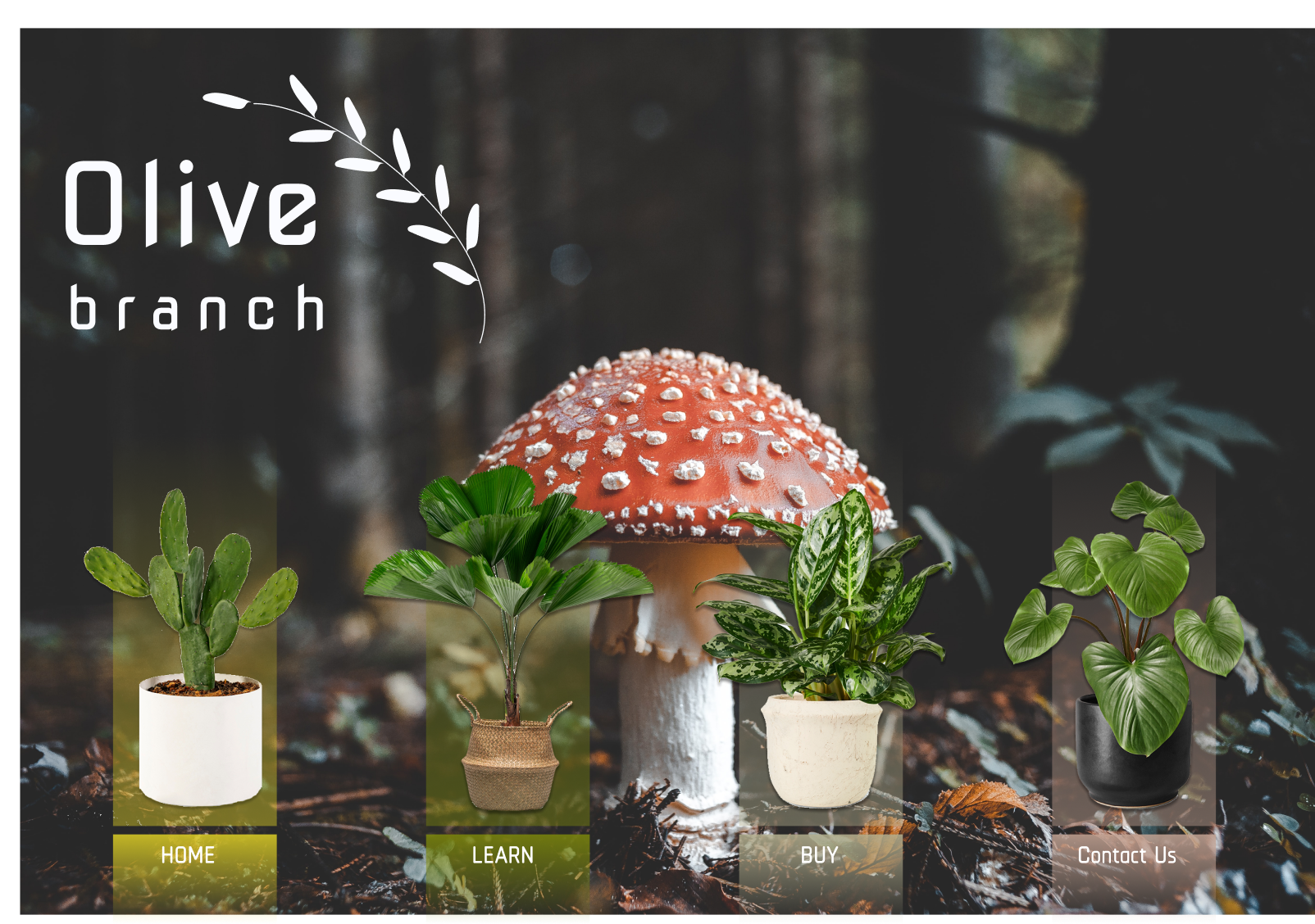
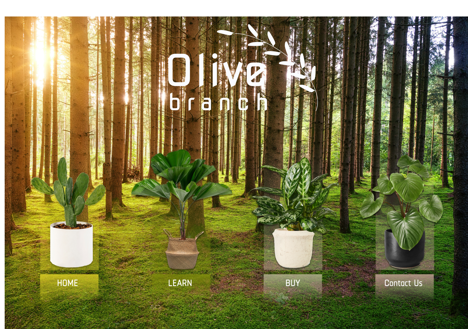
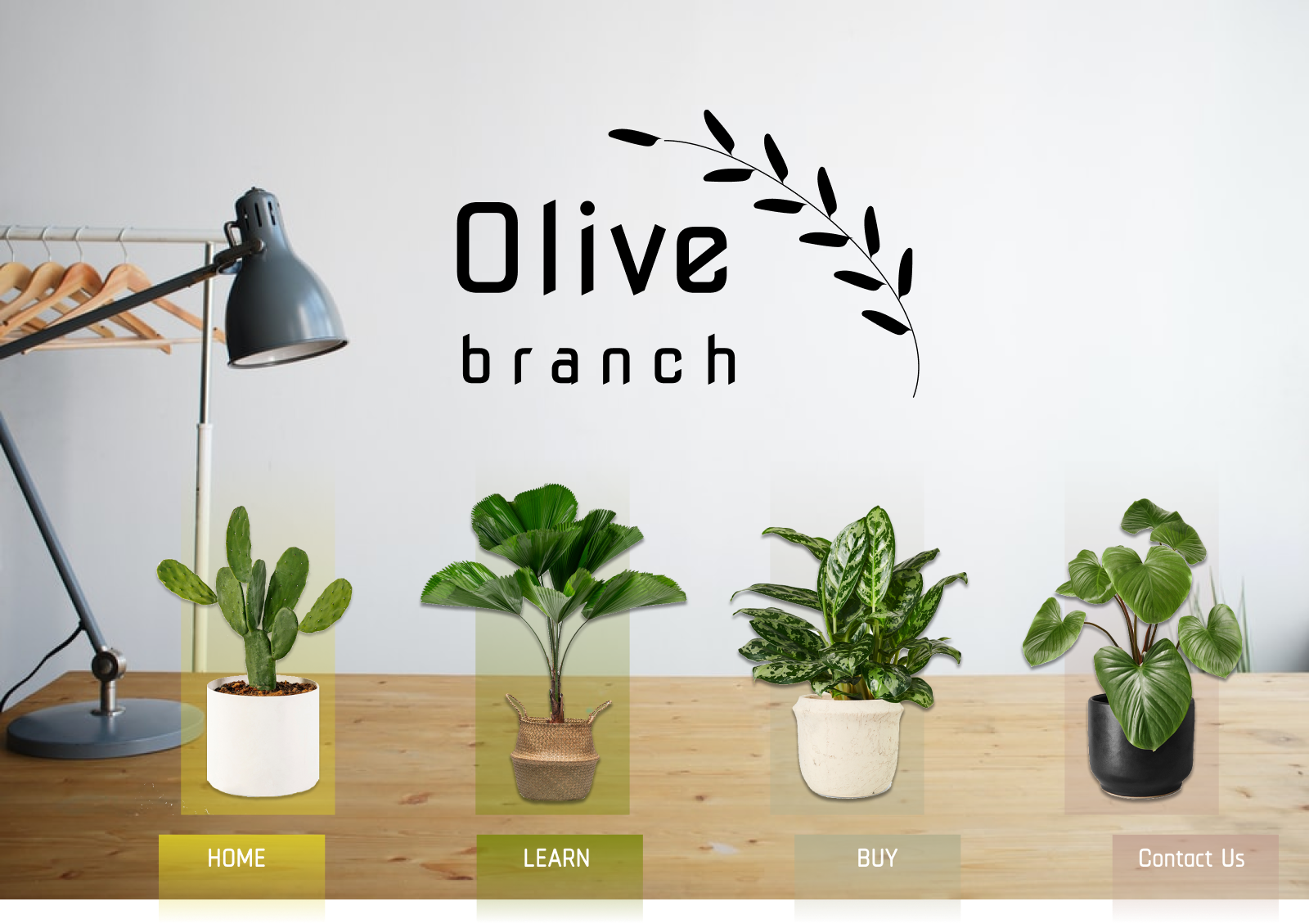
From our sketches, we then moved onto designing mockups of our website in Figma. Here are just four of our early mockups below. Although the hero images in the first three images are beautiful, we could not use them because of the lack of contrast between the image and the icons. From UX design principles, we know that lack of contrast undermines findability and accessibility, which hampers the user experience. Once we got to the image featured on the far right, we all fell in love with the overall concept. We then continued to ideate off of that design.
After many rounds of ideation and revisions, we landed upon this design. We were excited about the look and feel, but our next rounds of user centered design would require us to make significant changes to ensure that our website met all of the items on Peter Morville’s honeycomb- useful, usable, findable, credible, valuable, desirable, and accessible.
Usability Testing
Having gone through the user centered design phases of research, concept, design, and develop, we were ready to move into the testing phase. We conducted two usability studies:
A/B Test to determine which version of the Learn and Shop page our users preferred
With version A, when the user clicks on the learn and shop button, they are taken to a single page that lists every searchable category
Version B presents each searchable category on one simple page, focusing the user’s attention, and requiring them to click on each category to learn more
Shopping usability test to evaluate three things:
How much time the user spends trying to get through the entire process
Whether there is any confusion through the purchase process
The ease of the process
Usability Test Findings
The insights provided gave us welcomed perspective into the user’s thinking. Our users mentioned the following:
Weird to have Learn and Shop as a combined feature
Inability to navigate to previous page
Uncertainty about how to find plants
Plant pictures in certain sections of the site are not appealing
Plant care icons are too small
Some of the jargon (for instance, perennial) is not friendly for novice plant owners
Final UI Design
A usability test finding that really stood out to us was the recommendation to separate the learn section from the e-commerce section. Once we made the change, it was clear that it added clarity and increased the ease of navigation. This was one of the changes that fundamentally shifted our website design and functionality, really providing a solid information architecture allowing users to find their known items, do exploratory searching and it allowed for better re-finding.
Our information architecture changed after the separation of the Learn section from the Shop section.

Before separation of Learn & Shop
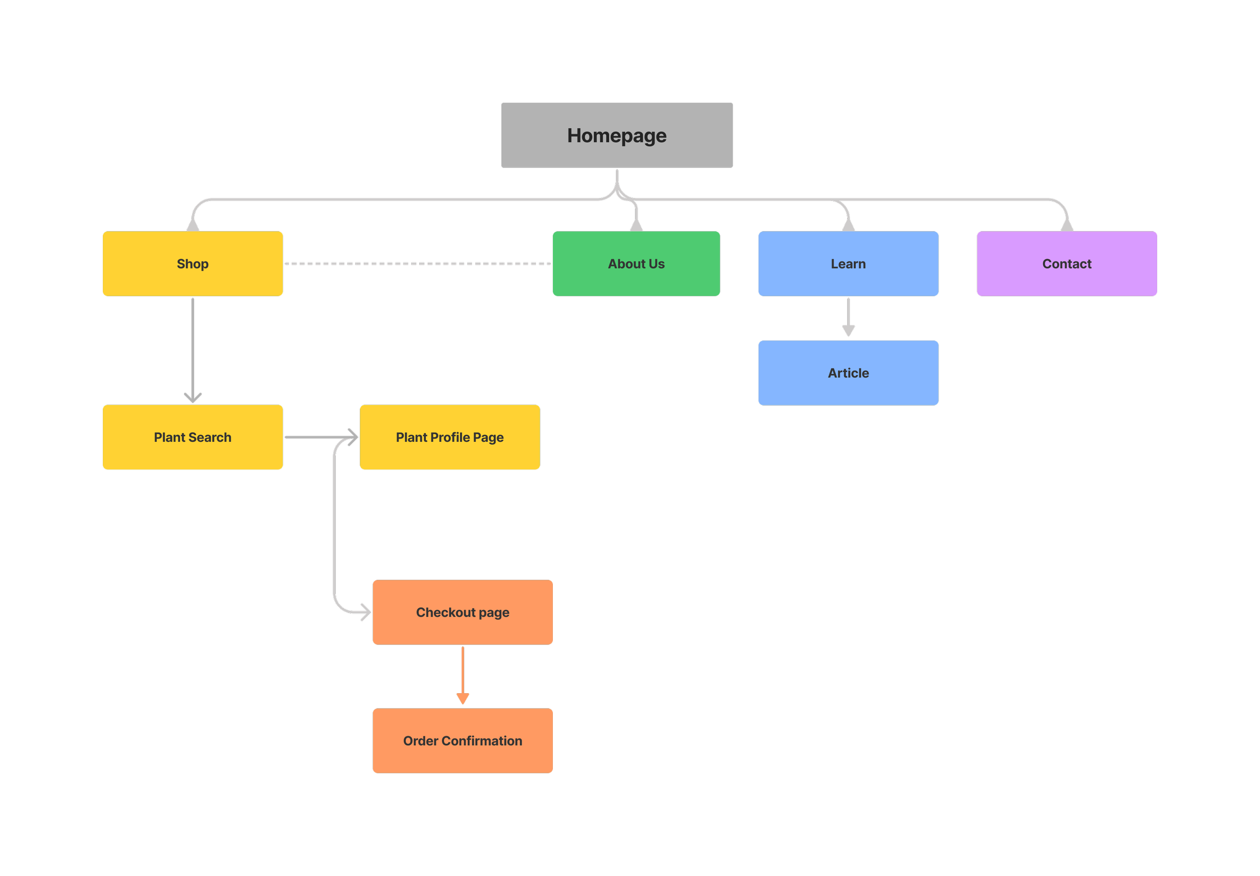
After separation of Learn & Shop
More Iterating
We made a slew of additional changes in efforts to address other usability test findings.
Navigational changes that we made:
Separated learn and shop
Added breadcrumbs and search functionality to help improve navigation
Added utility navigation items- shopping cart icon, login and signup quick links
Added a search function
Visual design changes that we made:
Removed the boxes around the words in the menu bar
Removed the box around the plant title and made the text bigger, in efforts to reserve the orange color for calls to action
Removed the boxes around the plant info and price/quantity sections because they didn’t add anything
Moved the plant care icons from a vertical orientation to a horizontal orientation
Updated the look and feel of the order summary section, and moved the payment methods section around to create a better user flow
Before making changes to Plant Profile page
After making changes to Plant Profile page
Final Design
Below is the final design of our website. Click on the right or left arrows to see the pages of the website:
What’s Next
We are looking forward to further defining our business scope and eventually launching our website. Before we can do that, we identified some other items that we would like to add:
Complete mobile app (our initial high fidelity wireframe is included below)
Add feature that auto sends plant care email based on plant(s) purchased
Further expand Learn section of site
Add glossary that defines terms related to plants and plant care
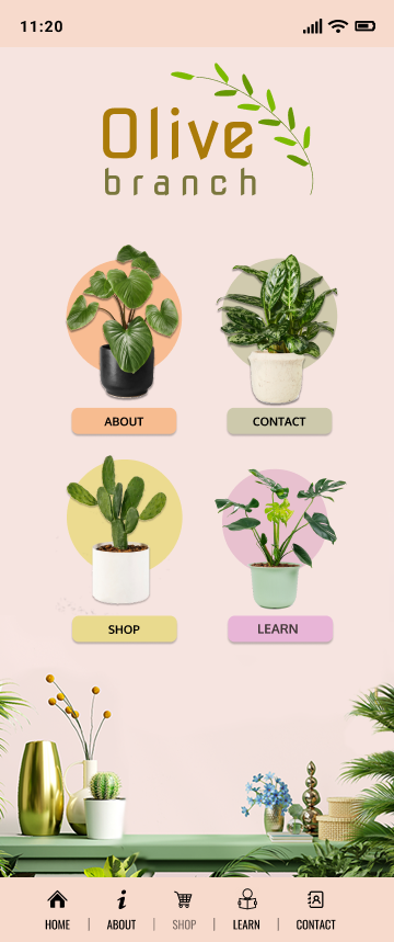
Mobile Home page
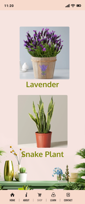
Mobile Shop page

Mobile Plant Profile page
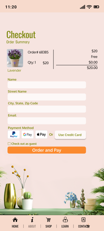
Mobile Checkout page


