Car Loan Application Re-Design
Digitizing a credit union’s car loan application
Project Overview
-
About the Project
Create an online car loan application interface for a small credit union's new mobile app. The interface should strike the proper balance between aesthetics and functionality.
-
Dates
April 2022; one week sprint
-
Tools
Figma, Google's Material Design system
-
My Role
UX Designer
UX Process
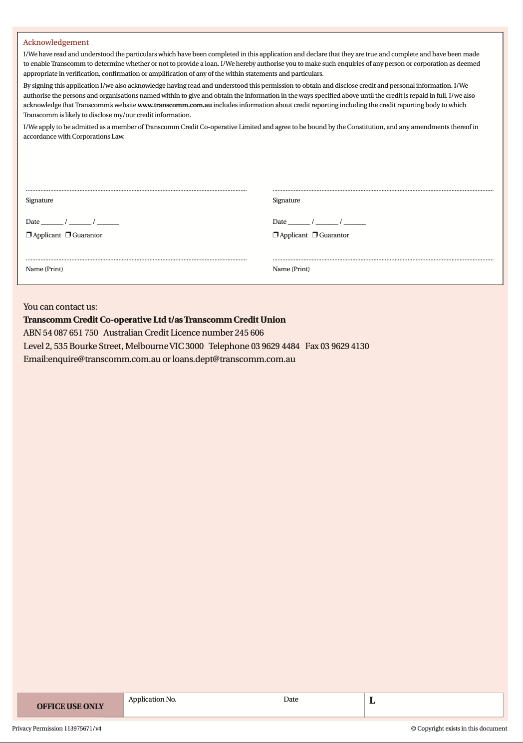
As a UX Designer, empathizing with the user and keeping them front of mind is of utmost importance. The credit union requested that I reference the paper application seen below for my design.
My first step was to review the application to note what elements should be used in the design, and what should be added or improved. I established the following goals to guide my design process:
Incorporate progressive disclosure
Minimize distractions
Reduce cognitive load
Make the form scannable
Proximity
The paper application that served as a reference:
-

Page 1
-

Page 2
-

Page 3
-

Page 4
-

Page 5
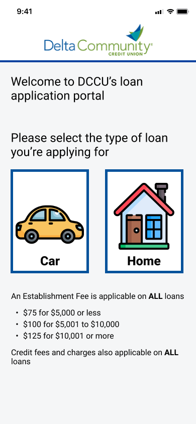
Screen #1
Since the credit union offers different loan products, this screen allows the user to pick which loan they are applying for. After choosing the loan product, the application opens up as a full screen to help minimize distractions.
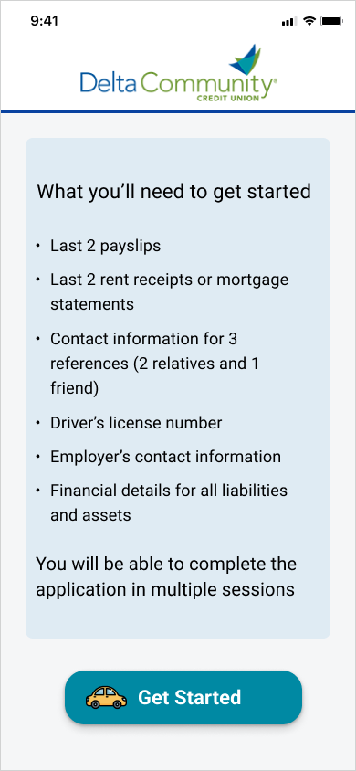
Screen #2
In the paper application, this page was last. In efforts to help the user prepare for the task at hand, I made this the second screen.
Screen #3
I implemented progressive disclosure in the form of a progress bar that indicates the remaining number of sections.
Screen #4
The user is given the option to “Save & Continue” so that they can complete the form in multiple sessions if needed. The “Cancel application” button allows the user to discard their partially completed form. Red is used for this button to distinguish it as an option that stops a process.
Screen #5
Proximity is created through the visual grouping of related questions. This helps with the readability of the form.
Screen #6
The label position used throughout the form ensures that the user always knows the requested content for the input field.
Screen #7
Users can click on the x within the input field to remove any non-applicable fields.
Screen #8
This is the final step for submission of the application.
Screen #9
After submitting the form, the user is taken to this screen. To reduce cognitive load, the disclosures are listed in categories and the user can click on each one to read the full content. They can also email a copy to their inbox.


